Expandables can be used for displaying non-essential information on a page. They are also helpful for FAQ sections, schedules, and for conserving vertical space by collapsing secondary information on mobile devices.
The find function will not discover information hidden by a collapsed expandable, so use good judgement in deciding which information to hide.
Non-javaScript users should default to the expanded state. Otherwise, the default state (expanded or collapsed) will depend on the circumstance.
Style
Individual
When only one expandable is used, it should include a stroke on all sides, heading text, and the expand/collapse minicon within a circle with a label reading “Show” or “Hide” (when possible). A white or 5% gray background can be used to highlight the section from the page background.
The entire bar is actionable. The header should clearly indicate what the user will see when the content is expanded (it should not be a call to action). Expand icons stay aligned at the top of the row when the title breaks to multiple lines.
Lorem ipsum dolor sit amet, consectetur adipisicing
elit. Neque ipsa voluptatibus soluta nobis unde quisquam
temporibus magnam debitis quidem. Ducimus ratione
corporis nesciunt earum vel est quaerat blanditiis
dolore ipsa?
Group
When expandable sections are used in a group, they are stacked vertically, with each row sharing its top or bottom stroke with the adjacent row. In this use case, expandables have no background color of their own, but match whatever color they are used on (this would typically be a white page or 5% gray well). Title text should be consistent across a group of expandables.
Lorem ipsum dolor sit amet, consectetur adipisicing
elit. Neque ipsa voluptatibus soluta nobis unde quisquam
temporibus magnam debitis quidem. Ducimus ratione
corporis nesciunt earum vel est quaerat blanditiis
dolore ipsa?
Lorem ipsum dolor sit amet, consectetur adipisicing
elit. Neque ipsa voluptatibus soluta nobis unde quisquam
temporibus magnam debitis quidem. Ducimus ratione
corporis nesciunt earum vel est quaerat blanditiis
dolore ipsa?
Lorem ipsum dolor sit amet, consectetur adipisicing
elit. Neque ipsa voluptatibus soluta nobis unde quisquam
temporibus magnam debitis quidem. Ducimus ratione
corporis nesciunt earum vel est quaerat blanditiis
dolore ipsa?
Specifications
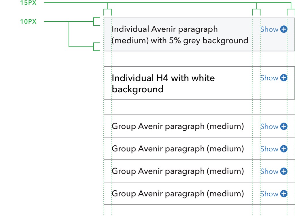
60% gray 1px strokes. All sides on individual, or top and bottom for grouping.
Optional 5% gray or white background for individual expandable.
10px top and bottom padding.
15px left and right padding.
15px padding between title and minicon with label.
Avenir paragraph (medium) or H4 title text.
Pacific blue minicon and label.
States
Collapsed
The default collapsed state should include the expand/collapse minicon within a circle and a label (if space allows). The Show/Hide label can be hidden at narrower screen widths to prevent titles prematurely breaking onto multiple lines and to reduced visual clutter.
Lorem ipsum dolor sit amet, consectetur adipisicing
elit. Neque ipsa voluptatibus soluta nobis unde quisquam
temporibus magnam debitis quidem. Ducimus ratione
corporis nesciunt earum vel est quaerat blanditiis
dolore ipsa?
Lorem ipsum dolor sit amet, consectetur adipisicing
elit. Neque ipsa voluptatibus soluta nobis unde quisquam
temporibus magnam debitis quidem. Ducimus ratione
corporis nesciunt earum vel est quaerat blanditiis
dolore ipsa?
Lorem ipsum dolor sit amet, consectetur adipisicing
elit. Neque ipsa voluptatibus soluta nobis unde quisquam
temporibus magnam debitis quidem. Ducimus ratione
corporis nesciunt earum vel est quaerat blanditiis
dolore ipsa?
Lorem ipsum dolor sit amet, consectetur adipisicing
elit. Neque ipsa voluptatibus soluta nobis unde quisquam
temporibus magnam debitis quidem. Ducimus ratione
corporis nesciunt earum vel est quaerat blanditiis
dolore ipsa?
Expanded
The content of an expandable can contain normal paragraphs, headings, lists, wells, and images.
Expandables can make use of an optional stroke under the title when expanded. The title stroke can help to define the title from the expanded content for longer sections of text. It should be indented left and right to match the text within the expandable section.
Lorem ipsum dolor sit amet, consectetur adipisicing
elit. Neque ipsa voluptatibus soluta nobis unde quisquam
temporibus magnam debitis quidem. Ducimus ratione
corporis nesciunt earum vel est quaerat blanditiis
dolore ipsa?
Lorem ipsum dolor sit amet, consectetur adipisicing
elit. Neque ipsa voluptatibus soluta nobis unde quisquam
temporibus magnam debitis quidem. Ducimus ratione
corporis nesciunt earum vel est quaerat blanditiis
dolore ipsa?
Lorem ipsum dolor sit amet, consectetur adipisicing
elit. Neque ipsa voluptatibus soluta nobis unde quisquam
temporibus magnam debitis quidem. Ducimus ratione
corporis nesciunt earum vel est quaerat blanditiis
dolore ipsa?
Lorem ipsum dolor sit amet, consectetur adipisicing
elit. Neque ipsa voluptatibus soluta nobis unde quisquam
temporibus magnam debitis quidem. Ducimus ratione
corporis nesciunt earum vel est quaerat blanditiis
dolore ipsa?
Interactions
Default
In the default mode, users are able to have multiple sections of an expandable group expanded at the same time, which allows users to easily compare information that is available in different sections.
Lorem ipsum dolor sit amet, consectetur adipisicing
elit. Neque ipsa voluptatibus soluta nobis unde quisquam
temporibus magnam debitis quidem. Ducimus ratione
corporis nesciunt earum vel est quaerat blanditiis
dolore ipsa?
Lorem ipsum dolor sit amet, consectetur adipisicing
elit. Neque ipsa voluptatibus soluta nobis unde quisquam
temporibus magnam debitis quidem. Ducimus ratione
corporis nesciunt earum vel est quaerat blanditiis
dolore ipsa?
Lorem ipsum dolor sit amet, consectetur adipisicing
elit. Neque ipsa voluptatibus soluta nobis unde quisquam
temporibus magnam debitis quidem. Ducimus ratione
corporis nesciunt earum vel est quaerat blanditiis
dolore ipsa?
Accordion (alternate)
With the “accordion” mode, users can only view the contents of one section at a time; when a user expands an additional section, the previously-expanded section will collapse automatically.
This can be desirable for maintaining the height of a group of expandable sections, but it can be disorienting when the height of the expandable sections is greater than the height of the user’s viewport (e.g., for users of mobile phones or netbooks), which can lead to off-screen sections closing and shifting all of the content on the screen. For this reason, you should avoid the “accordion” mode if the expanded height of any of the sections is greater than 400px.
Add the data-accordion="true" attribute to the expandable group to activate the accordion mode.
Lorem ipsum dolor sit amet, consectetur adipisicing
elit. Neque ipsa voluptatibus soluta nobis unde quisquam
temporibus magnam debitis quidem. Ducimus ratione
corporis nesciunt earum vel est quaerat blanditiis
dolore ipsa?
Lorem ipsum dolor sit amet, consectetur adipisicing
elit. Neque ipsa voluptatibus soluta nobis unde quisquam
temporibus magnam debitis quidem. Ducimus ratione
corporis nesciunt earum vel est quaerat blanditiis
dolore ipsa?
Lorem ipsum dolor sit amet, consectetur adipisicing
elit. Neque ipsa voluptatibus soluta nobis unde quisquam
temporibus magnam debitis quidem. Ducimus ratione
corporis nesciunt earum vel est quaerat blanditiis
dolore ipsa?
Accessibility
The find function will not discover information hidden by a collapsed expandable, so use good judgement in deciding which information to hide.
Non-javascript users should default to the expanded state. Otherwise, the default state (expanded or collapsed) will depend on the circumstance.